A new, fresh and clear Autotaalglas.
Rebranding and Repositioning Holland’s 2nd largest vehicle glass repair and replacement brand.
Since 1986, Autotaalglas has made broken car windows its bread and butter. Now a part of Belron®, the global market leader in repairing and replacing vehicle glazing, what started out as a sole proprietorship is today a nationwide franchise with 54 branches.
Addikt was commissioned to reposition the Autotaalglas brand to make it feel more approachable and trust-worthy.
We also rebranded Autotaalglas to suit the needs of the digital audience, make its communications more effective, and customer-friendly.
Repositioning:
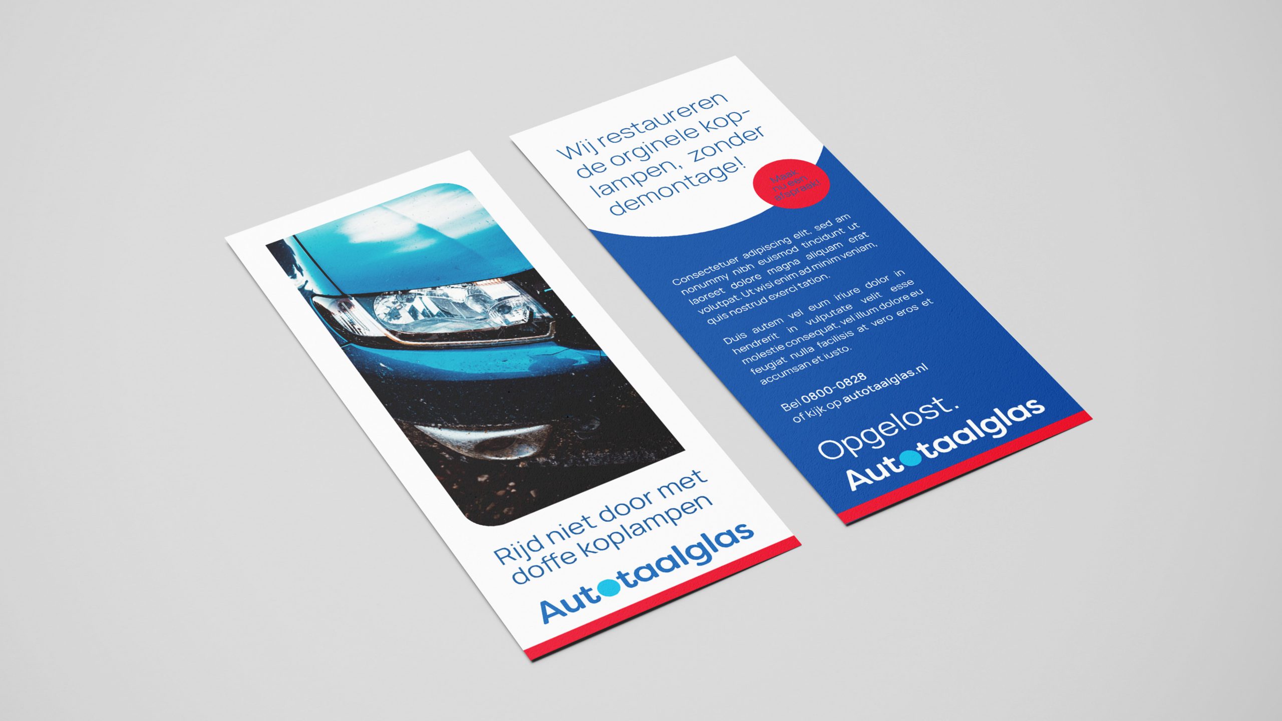
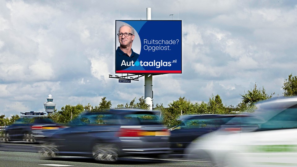
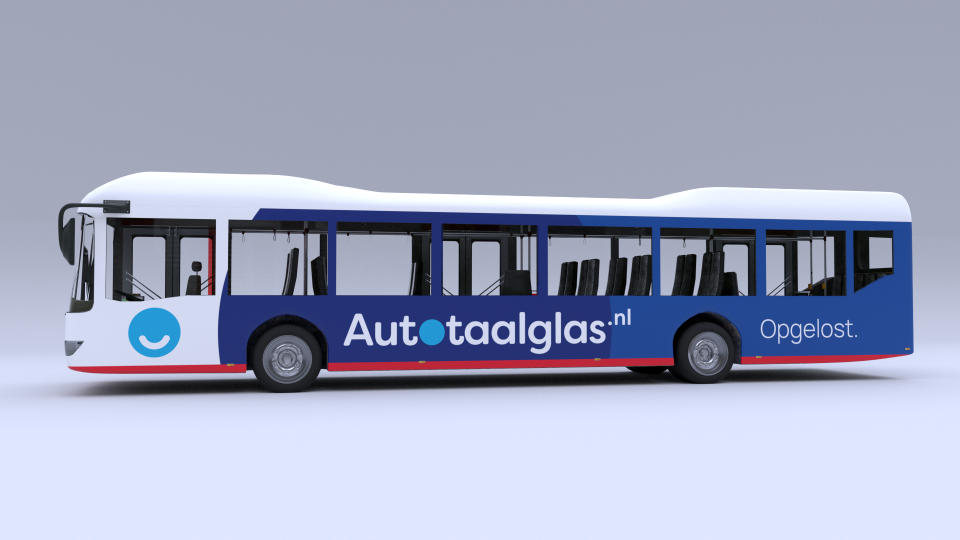
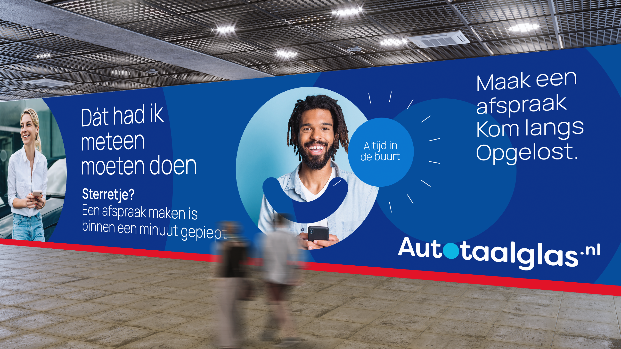
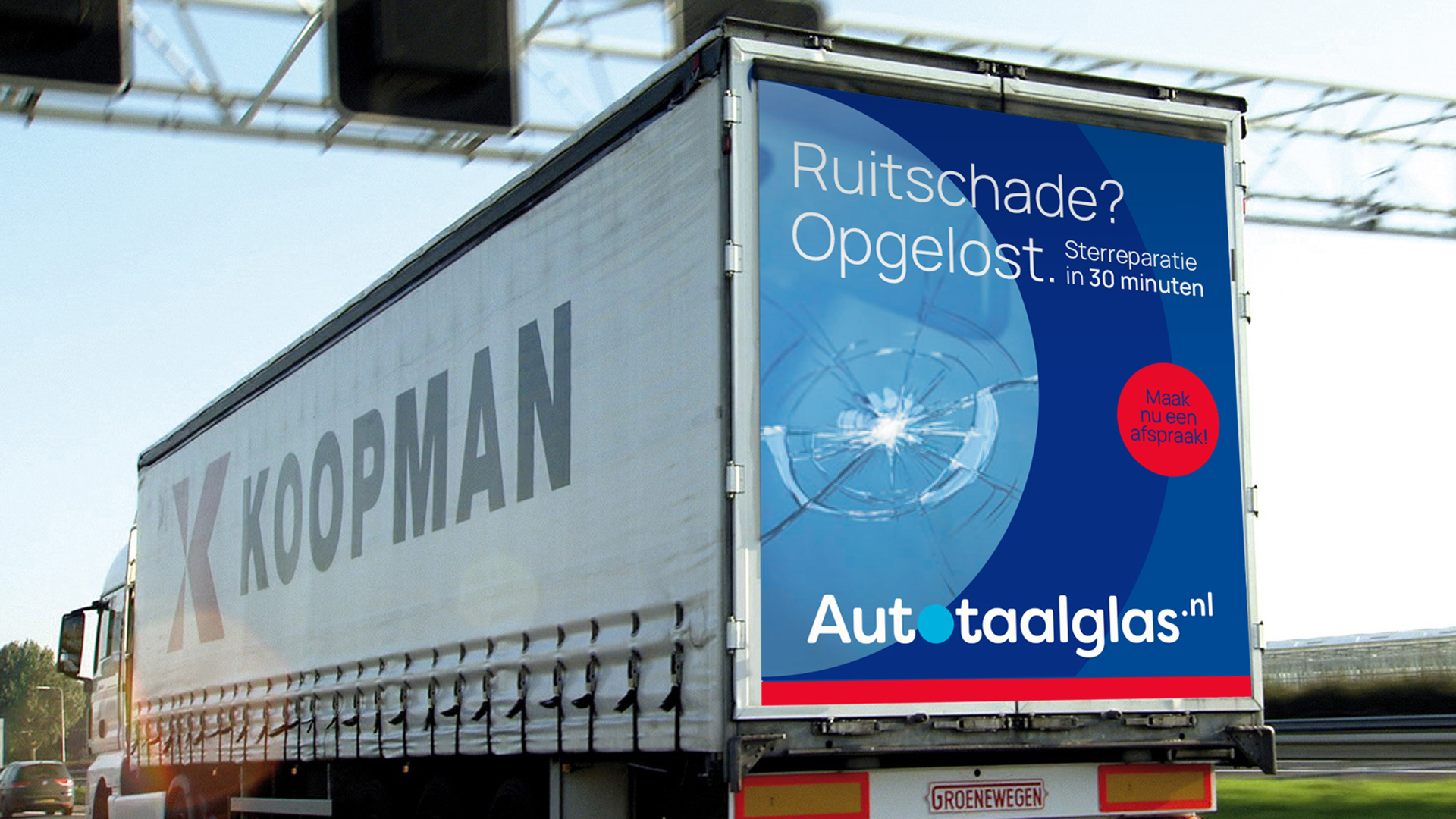
Humane. Efficient. Committed. These three words summarise the shared values of the Autotaalglas franchisees. In collaboration with Wouter Boon, we came up with a 4th word for the brand - Opgelost. Meaning solved/done. Like how one says after a job is done or a problem is solved.
Opgelost sums up the brand’s promise – To go all the way to ensure a customer’s happiness. And do it with a smile on their face, always.
Rebranding:
Autotaalglas’ old identity was designed for print. It wasn’t scalable and resonated poorly with its target audience.
Our goal for rebranding Autotaalglas was to optimise the brand’s design for its digital communications, and make it more relatable and customer-friendly.
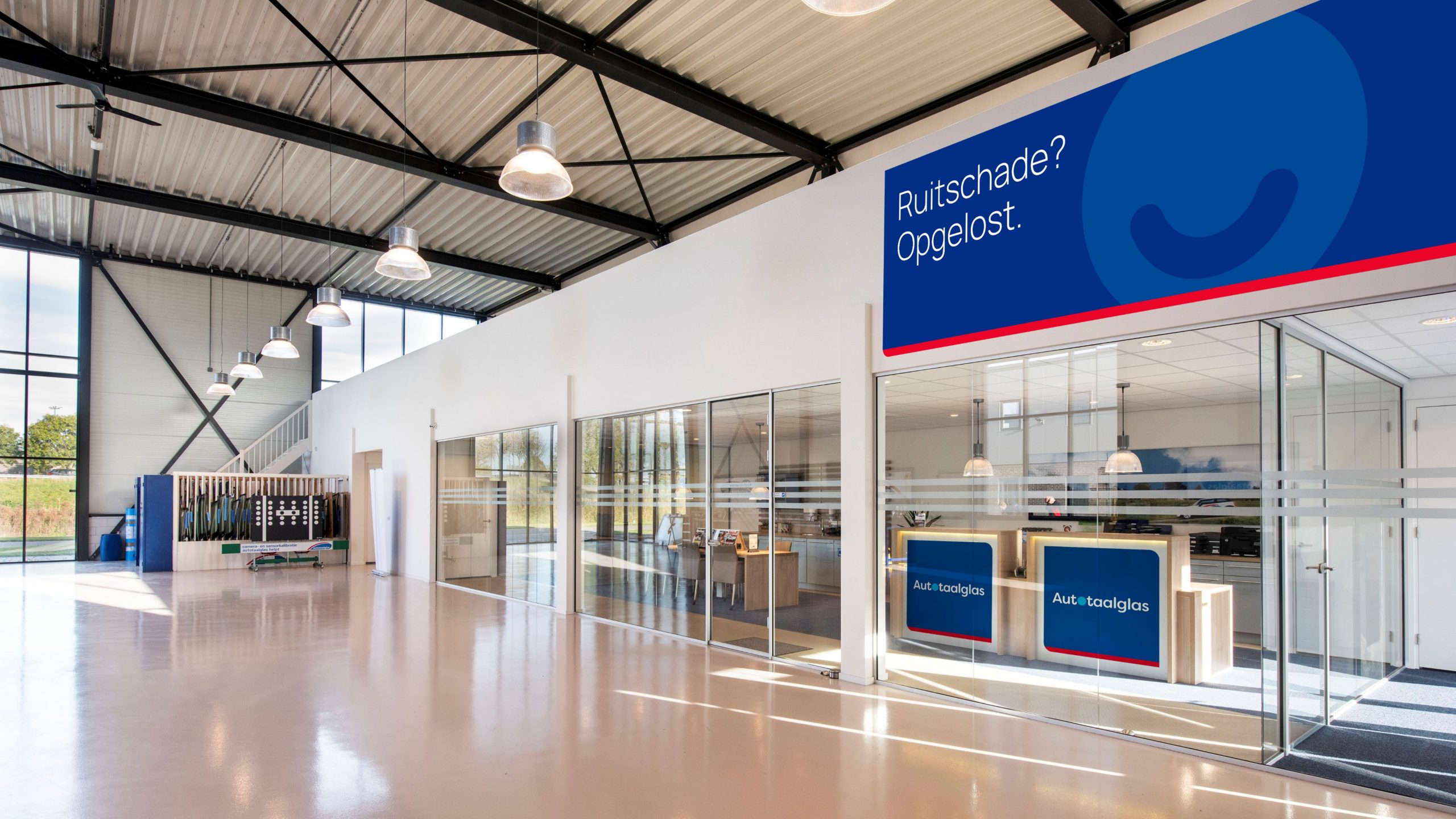
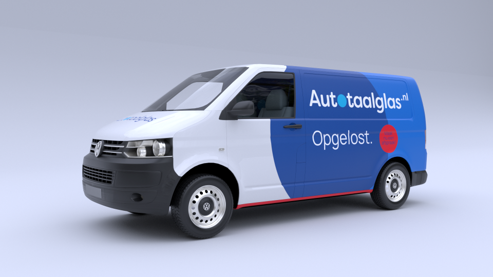
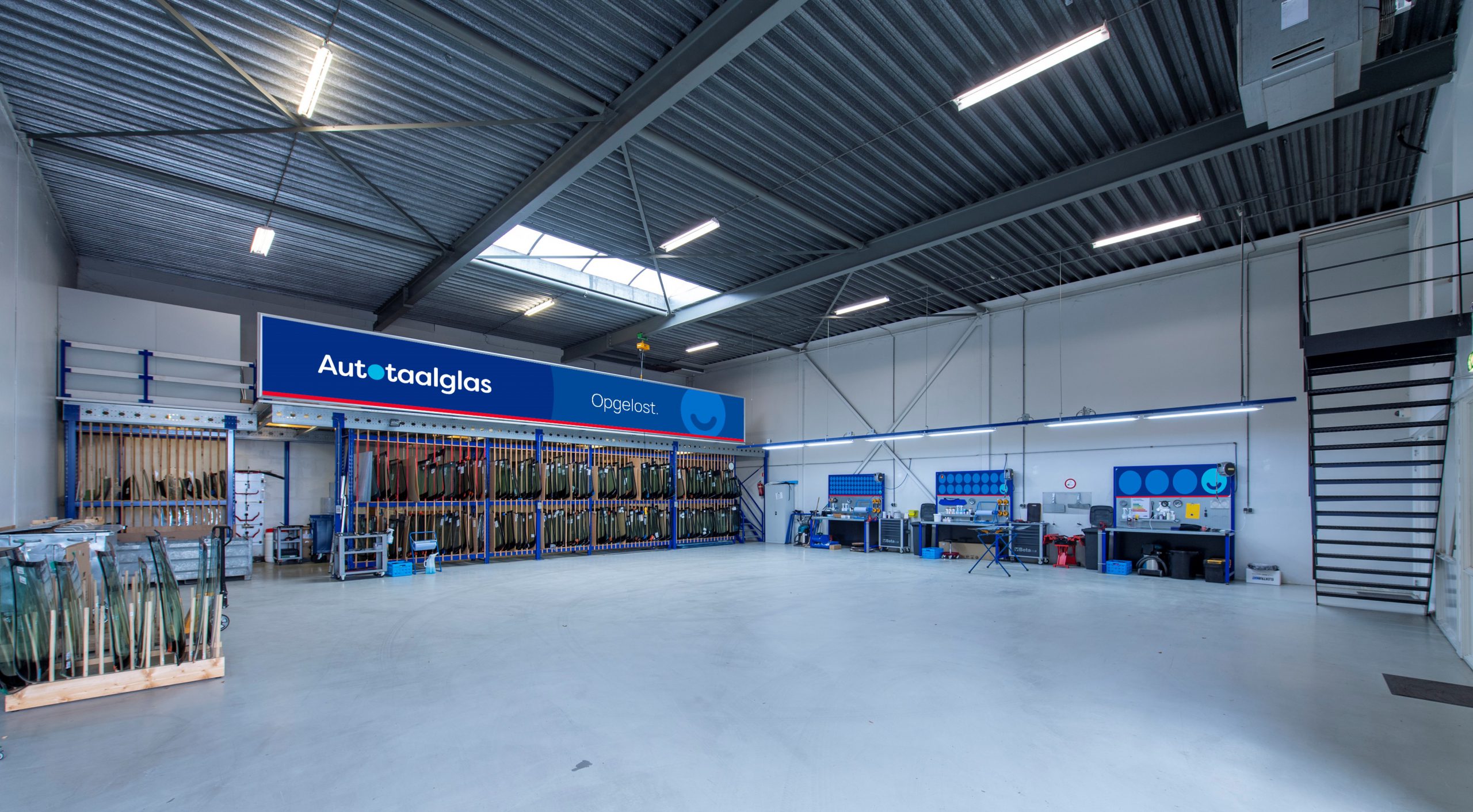
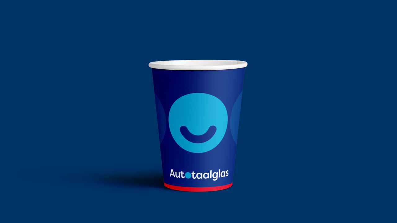
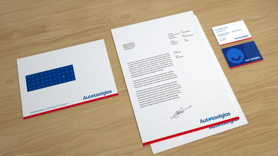
With the use of a distinctive Blue – Red – White colour palette, we set it apart from the competition. And by integrating the smile into its identity, we created a positive and problem-solving attitude for the brand through its communications.
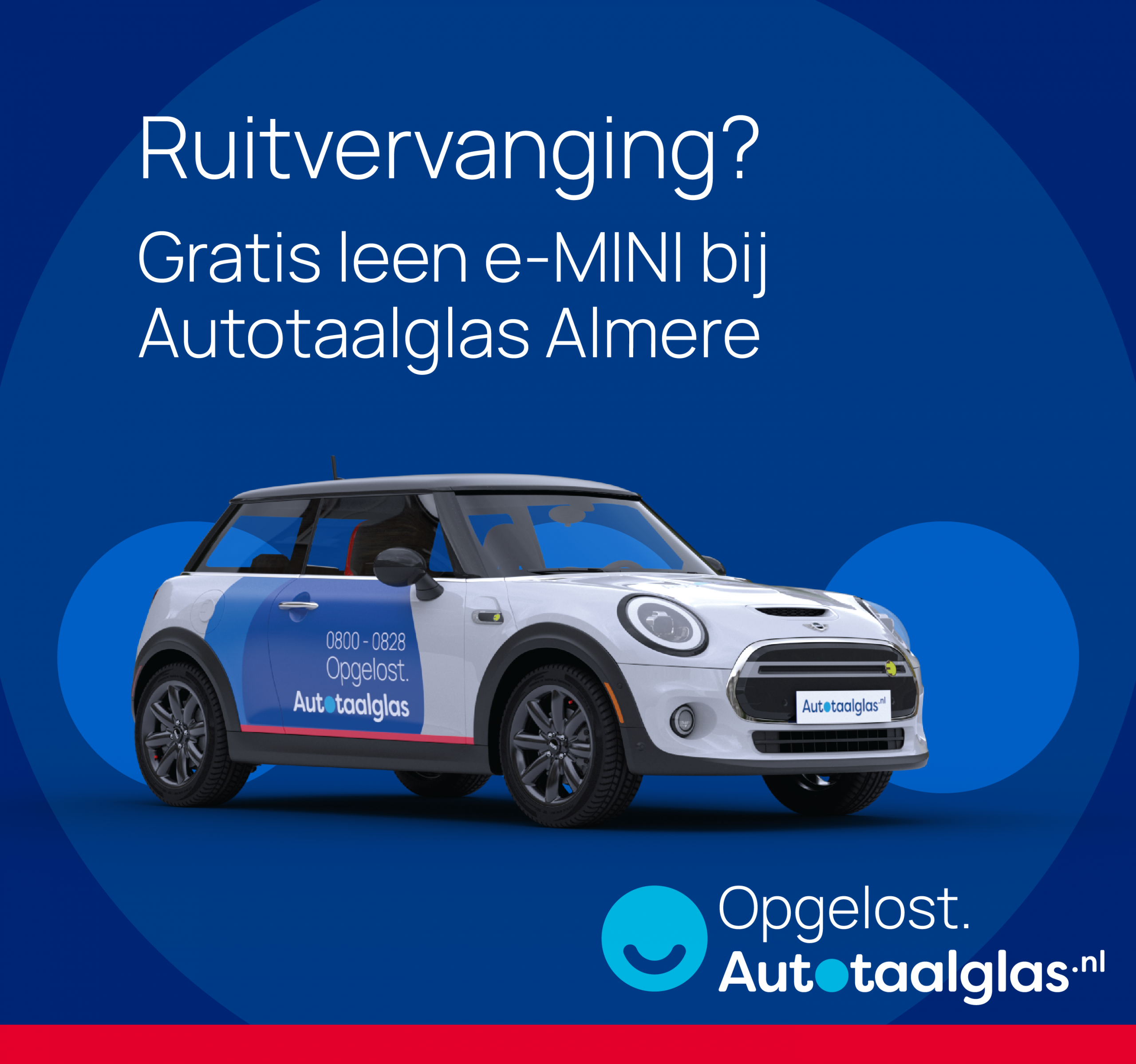
The rebranding also highlights the entrepreneurial spirit of Autotaalglas’ individual franchisees, who are always willing to go the extra mile to solve their customer’s problems. The new look became the base for communicating additional services such as headlight polishing, windscreen wipers, and ozone treatment.
Results:
Autotaalglas launched its new positioning and brand identity in July, 2021.
- Within just 2 quarters, the brand saw more than 154 million registered interactions.
- 18,000 new clients were converted online, and more than 4,000 customers were serviced via chat and WhatsApp.
- On social, the overall brand appreciation and likeability grew significantly.
The updated signages and in-store communications breathed fresh life into their 54 branches, successfully reiterating the brand’s philosophy to their customers. Additionally, individual social media channels were created for most of these branches to help them to reach out to and service their customers directly.
We have laid down a toolkit and service pipeline in place to help branches with their local communications and activations.
Autotaalglas is currently sponsoring Qmusic Top 40 – one of Holland’s top radio shows.
Structure for storytelling:
1. Problem/irritation/emotion/
customer thought.
2. Do this
3. Then this is the result
4. Fixed. Opeglost.
Identity System:
Autotaalglas’ identity system is built around a collection of fixed brand assets.
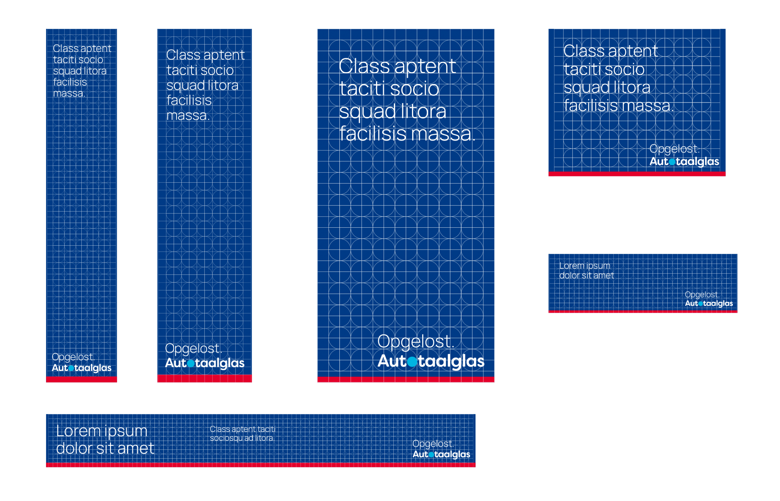
Colour
We have the blue background for B2C communications, and a grey background for B2B outings.
Motif
A Red bar at the bottom creates a recognisable brand pattern, even on communications where the brand’s logo is not shown.
Grid
We are using a square grid to ensure that the proportions are always the same.
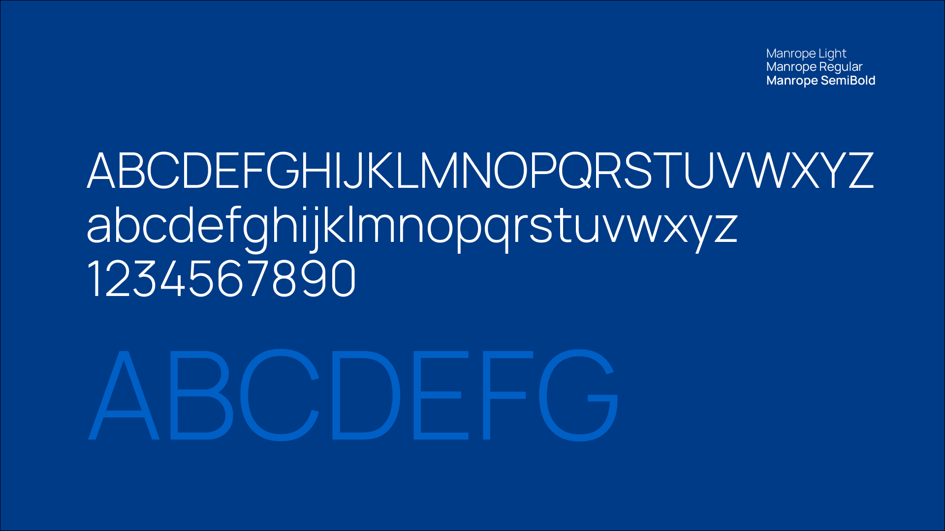
Manrope Light
The font is Manrope, a free Google font. This allows every branch to create their own communications without having to worry about licences.
The headline font’s weight is light, projecting a friendlier tone of voice to create more likeability for the brand.
Objectives, achieved.
Repositioning the brand fulfilled a few strategic needs:
- Updating: The logo was originally designed decades ago. It needed an upgrade to work well for the digital world. Where identities need to be used fast by multiple franchises across the country. And for multiple forms of communication.
- Expressing: We needed to capture the happy-to-help, problem-solving, enterprising spirit all of the brand's franchises. That neighbourly service provider, who always goes the extra mile.
- Belonging: To tie the franchisees together with a common thread. To give Autotaalglas' real target audience, its partners, a sense of pride and belonging – a sense of identity. Because ultimately, franchisees are the trustworthy people delivering the real experience to consumers on ground.
Sonic Identity
The Autotaalglas sonic identity is based around sound effects rather than music. The layered sound fx give the impression of ease and straight forwardness.
In sequence they show the customer journey. From cracked window, frustration, connecting with Autotaalglas to the solution and then solved. It was as easy as that, so now life can continue with out your windshield on your to do list.
The sound logo is the sonic impression of the word Autotaalglas. Opgelost.
Using print ads, outdoor billboards, and social media, we communicated the brand’s renewed identity design to their customers. We also ran radio ads and 360 campaigns for their individual products such as headlight polishing, windshield wipers, etc. All in all, the all-new positioning and identity marks an all-new era for Autotaalglas.
Opgelost.
Autotaalglas.